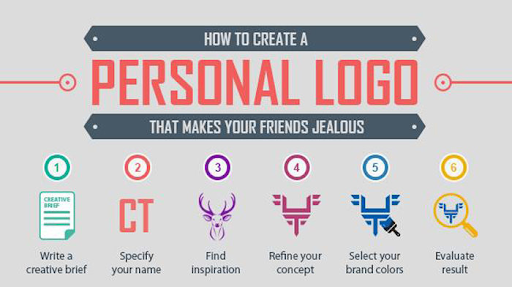
The logo of a brand serves as its public face and is the first thing that potential customers will see. You must have spotted logos all over the place. They play an important role for a brand to get customer recognition.
The same goes for a personal logo, if you are a certain individual who works as a freelancer and provides one or multiple services, you need branding and identity for the audience to recognize you right away.
You might not be able to spend a hefty sum on varied marketing strategies as a corporation would, but you can always design a logo that can give you a lot of exposure among other people.
Designing a logo can be difficult sometimes, even for designers it can be a very thoughtful process that includes trial n error until they get the final product.
Thankfully, there are a number of designing web tools available for non-designers to assist you while designing a logo.
The importance of a logo is evident from the fact that designers take immense care of minute details of the design they are working on. Paul Rand has said, “A logo doesn’t sell, it identifies.
We will discuss the different categories of logos which can surely inspire you to design yours.
- Tweak your name spell
Your logo idea can be as simple as your name or your brand name. Although you can be creative and show your design skill with a tweak in the spelling style. A simple tweak can introduce your style statement in the logo. These types of logos are generally known as “Wordmark” logo
A large number of renowned brands you already know of have gone for this type of logo. Often a brand with a name that sounds unique and is easy to spell goes for this type of logo. E.g. Google, VISA, COCA-COLA etc.
A lot of professional designers go for this type of logo because this kind of creative logo draws the audience’s attention and they remember the brand name as well.
- Showcase your style
Create a logo that reflects your sense of style. Your style statement should be reflected in this type of logo. For a designer with a certain design aesthetic, these logos can be very effective. This logo not only reflects the company, but also the artist’s conception.
Viewers may be left with a lasting impression of these logos and it also helps them to remember the artist easily.
- Place your face
Being a designer yourself gives you the upper hand and the creative liberty like no one else. If you have some illustration skills up your sleeves you can go full artist and illustrate your face with some design tweaks and boom!!! An excellent free logo design unique to you is ready to make you stand out. There is no way a viewer can see your logo and not remember who this belongs to.
Such a distinctive design will also give you a strong digital presence.
- Minimalistic approach
A subtle and minimalist logo projects a sincere and sophisticated brand image on viewers. Your logo doesn’t have to be a Picasso art piece to be recognized by your audience. A minimalistic logo creates space for your other design works and helps them to get in focus rather than overshadowing them by being the centre of attraction.
Remember that the purpose of your logo is to help you sell your designs.
- Pun intended (*Punny Logo)
The Internet has gone crazy about memes and puns in the past few years. One will have an obvious advantage if they can pull this out in their favour. Of course, not every brand name can be used as a pun but if you are a “punny” designer, you can find out a way. A little tweak in brand name and a design element and you’re set to go.
This logo by the artist Micheal ‘Penda’ serves as a good example of a Punny logo.
- Mascot logo
A number of brands, organizations, and events have deployed mascots for marketing. These mascots often are funny, cartoon-like, and playful. A mascot easily becomes the brand face and is always impactful. Few brands get one step ahead in design strategy and use their mascot as the logo as well. This scheme makes takes them way ahead in the logo game and they’re far more easily recognizable than others.
One of the most common brands renowned for its mascot logo is KFC which has used Mr. Colonel as its mascot and logo.
- A mascot logo should be of reasonable size so that it is visible and prominent.
- A mascot logo should be detailed enough to be recognized by the consumers.
- Combination Logos
A brand shouldn’t just stick to one type of logo. When it comes to logos, one has creative freedom and there is no hard and fast rule to it. You can use a combination of logos. Often symbolic and pictorial logos are accompanied by Lettermark or Wordmark logos.
A lot of famous brands such as Dove, Doritos, Burger king, and many others have gone for a combination logo.
- A combination logo works best when the symbol and wordmark both relate to the brand image.
- The components of the combination logo must have a contrasting color scheme or else they’ll appear messy.
- The space aspect should be well taken care of in a combination logo. A gap too large or too close will make the logo look unpleasant.
- Letterforms
Letterforms are logos that represent the brand by the Initial letter of the brand name only. Letterforms are minimalistic in design yet bold enough to be recognizable. However, if the design elements are not well curated a letterform logo can appear dull and lose the visibility aspect, and can often go unnoticed.
When it comes to letterform logos Netflix, McDonalds, Unilever and few others are exemplar.
- Letterform logo design depends on a single letter and hence the design has to be impactful to leave an impression on audiences’ minds.
- A bold and funky color scheme would go best with the letterform logo. It’ll help draw customers’ attention easily.
- Emblem Logos
As the name suggests, the Emblem logo design flaunts symbols, crests, or badges. These are traditional logos but their charm hasn’t gone out of trend. The emblem logo may or may not reflect the brand face. As a designer you can design any emblem of your choice that you feel goes with your aesthetics.
Educational institutes, Sports clubs, Government organisations often go with emblem logos. One of the most renowned brands that flaunts an emblem logo is Starbucks.
- When designing an emblem logo, one should put details so that it can be recognised. It should be scalable.
- Make sure to add your style elements in the logo to give it a distinct vibe, else it’ll be easily lost in the crowd.
- Dynamic Logo
Dynamic logos are the most versatile kind. The reason a logo is called dynamic is because they are focused on one key element which remains the same while the other design element changes from time to time. Due to the key element, the design is always recognizable while the changing style gives it a new look every time.
- If you’re going for a dynamic logo make sure your key element is distinctive enough to be recognizable.
Final Words
Throughout the article we have gone through various types of logos. We hope these logos inspire you to design one of your own that helps you and your brand get a distinct position among others and makes your work visible to a large audience. Always remember, no matter what type you go for, the logo should have your brand and design essence.


